01 apr. Rome Through Classic Chrome — A Technical Approach
I’ve wanted for a long time to build a series from Rome.
These images were shot back in 2019, using a simple setup — a Fujifilm X-T20 paired with the 18–55 kit lens. Even though I photographed quite a lot, I never managed to create a coherent gallery from that trip. What I had were scattered frames, without a clear direction, and very few images I considered truly finished.
Coming back to them now, I started looking at them differently. Not from the perspective of “which are the best photos”, but rather “which ones could actually form a series”.
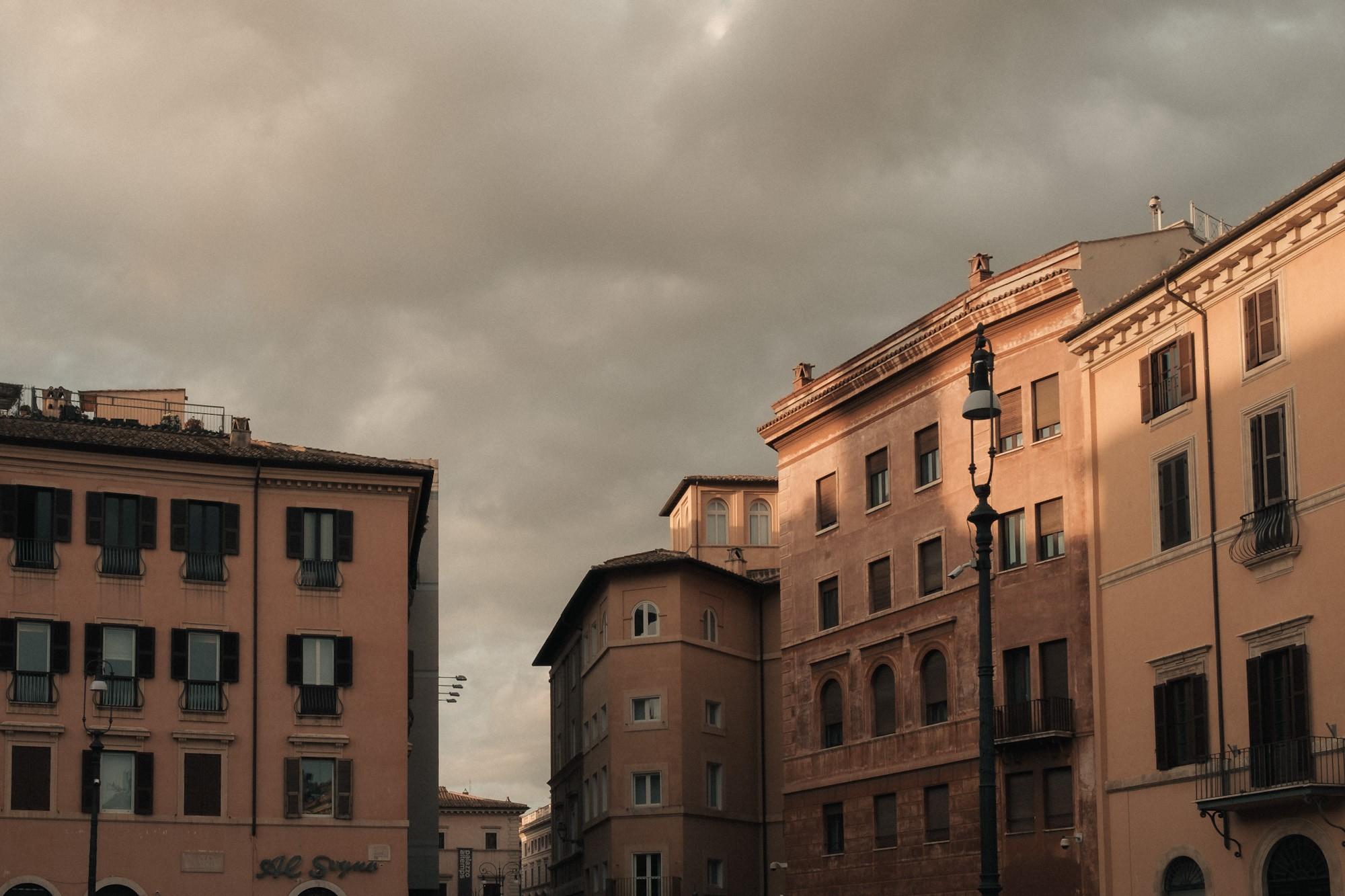
As I went through the archive, the direction became clear: this was not going to be a classic travel set. I removed the obvious frames — monuments, landmarks, postcard angles — because I didn’t feel I could say anything new with them.
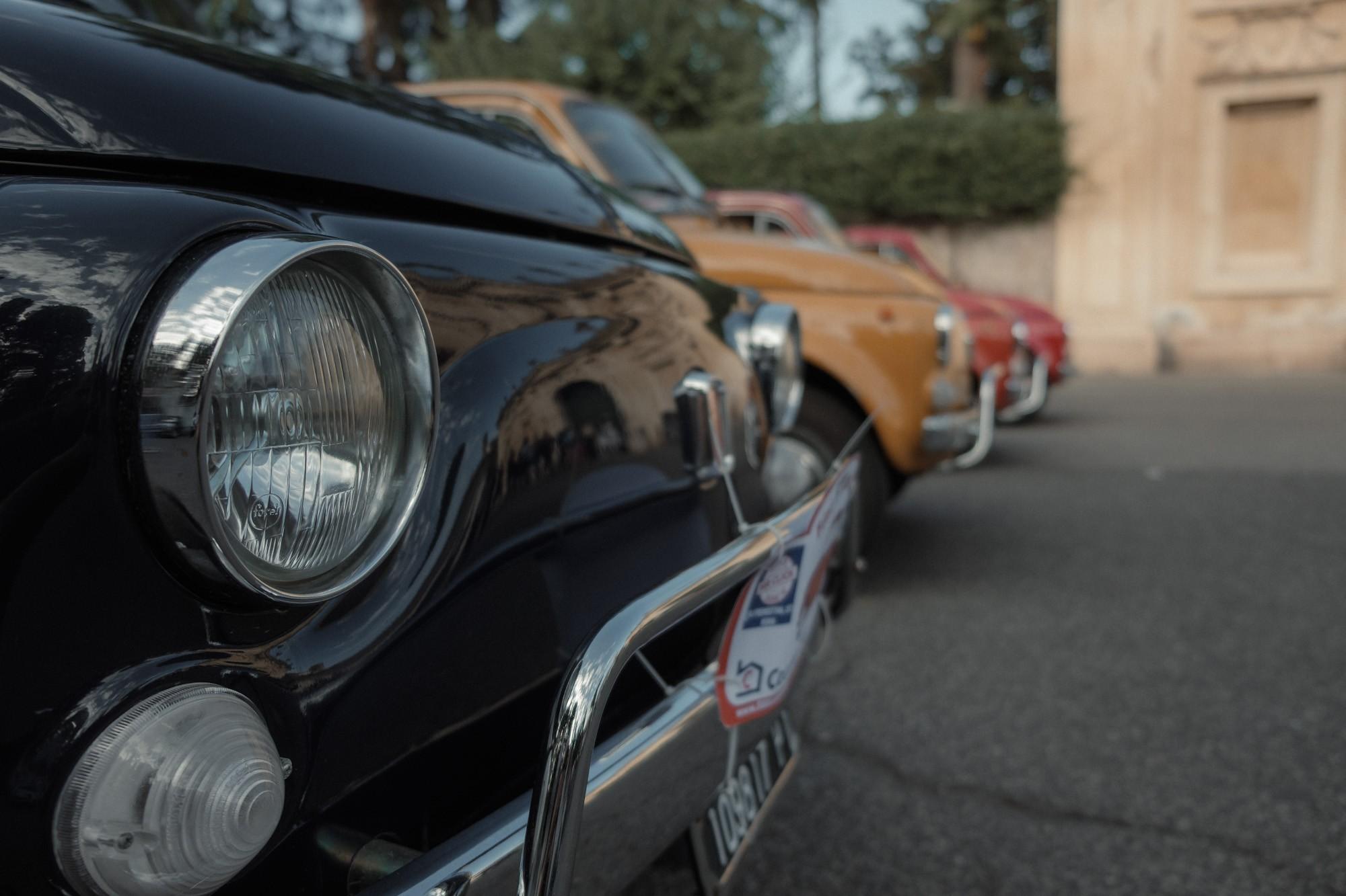
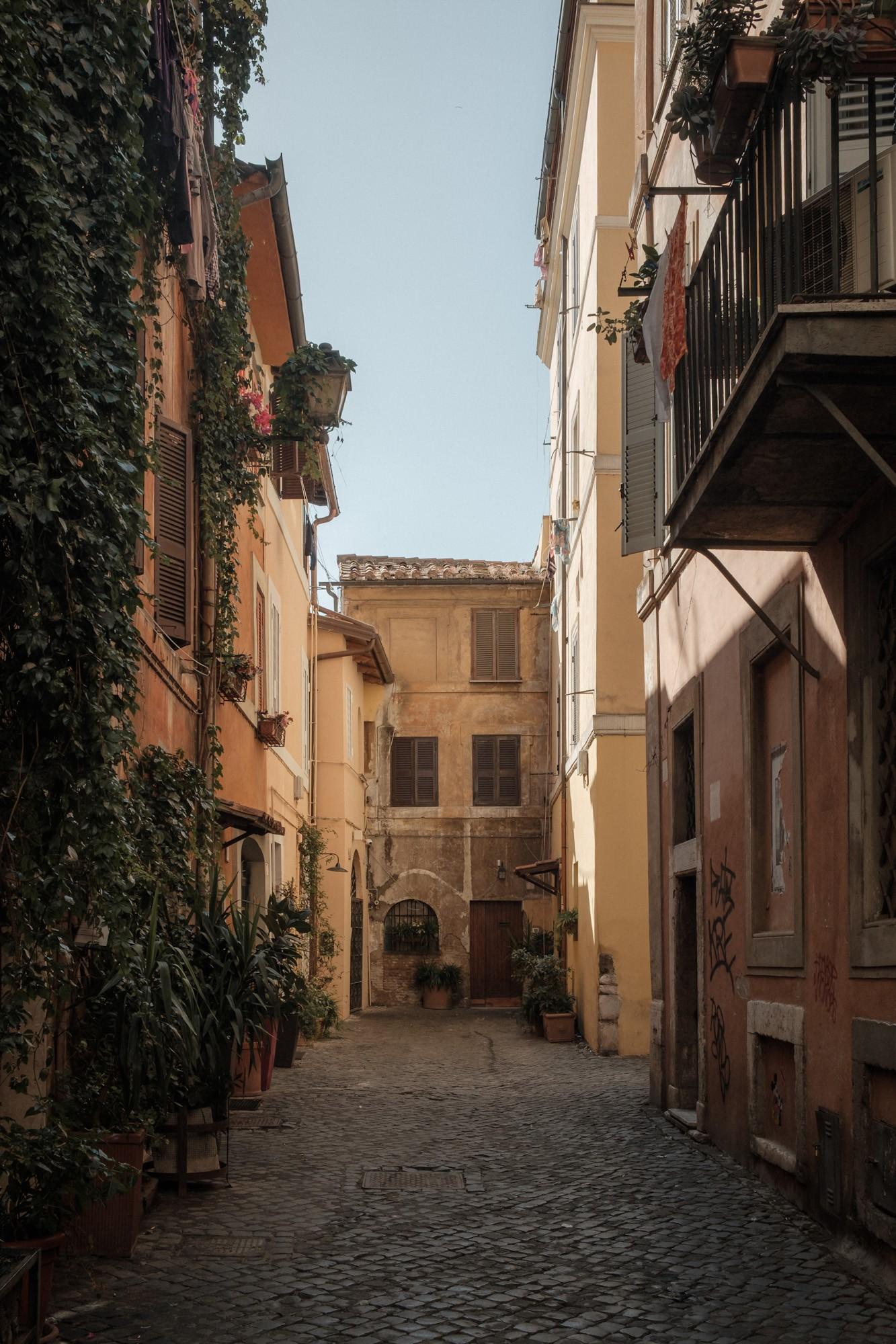
Instead, I kept simpler images — details, objects, everyday moments — that together build a more personal version of the city.
This is not Rome as it’s usually shown. This is Rome as it’s lived.
How I Selected the Images
This series didn’t start from the idea of a “best of Rome”. It started from the opposite.
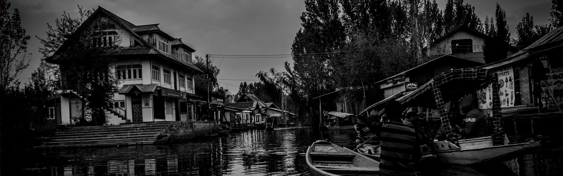
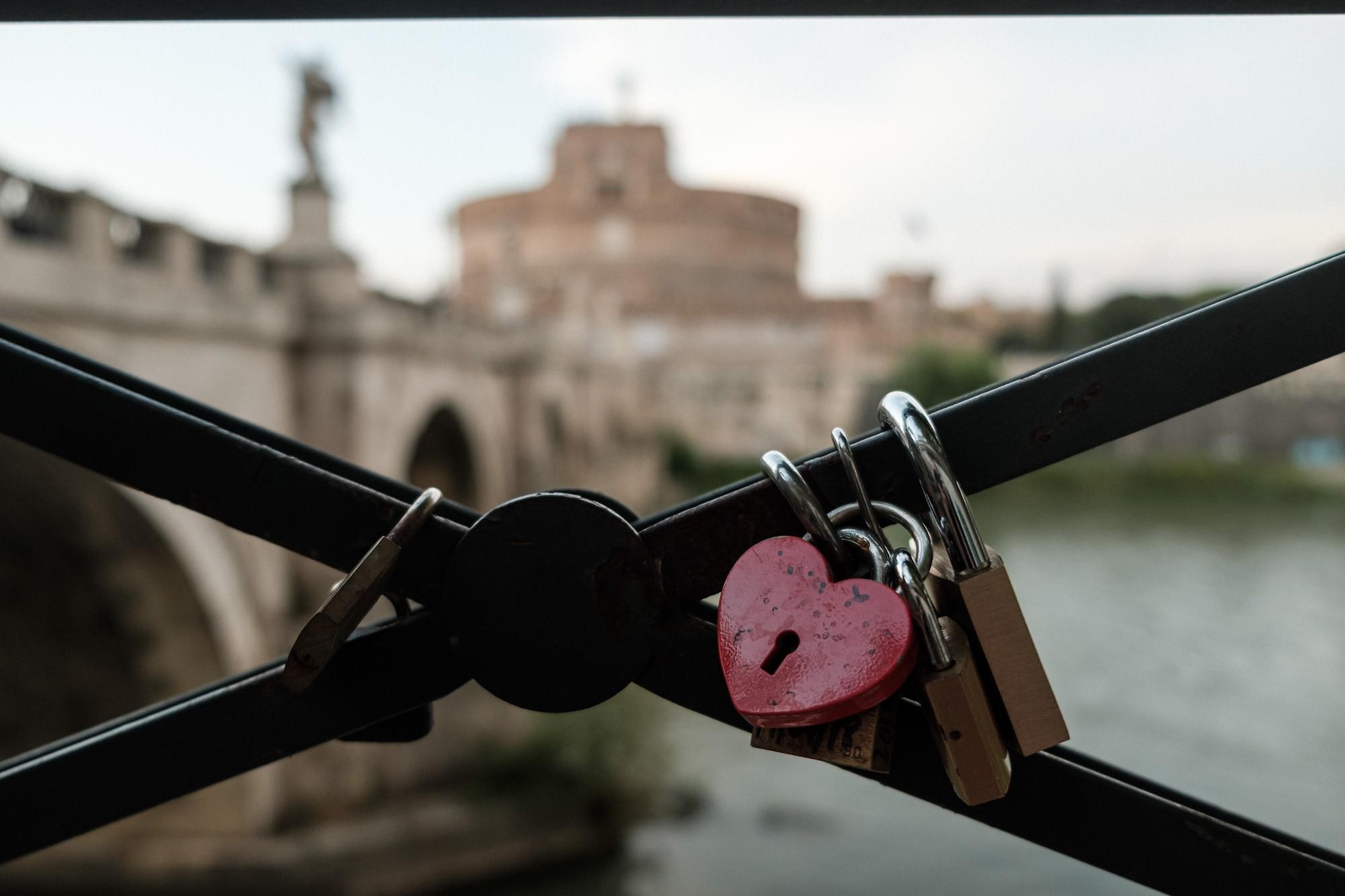
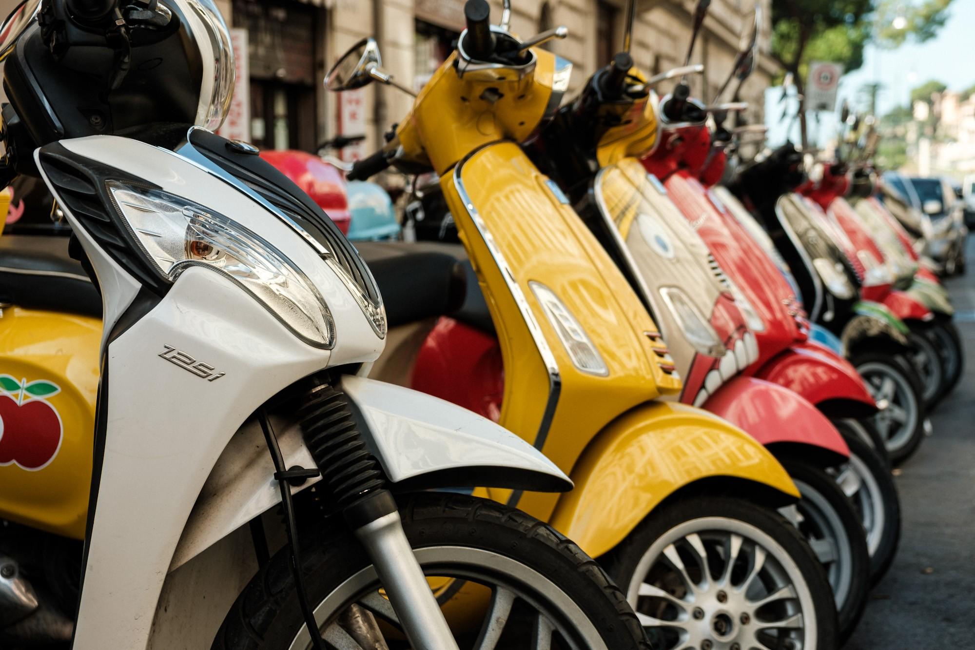
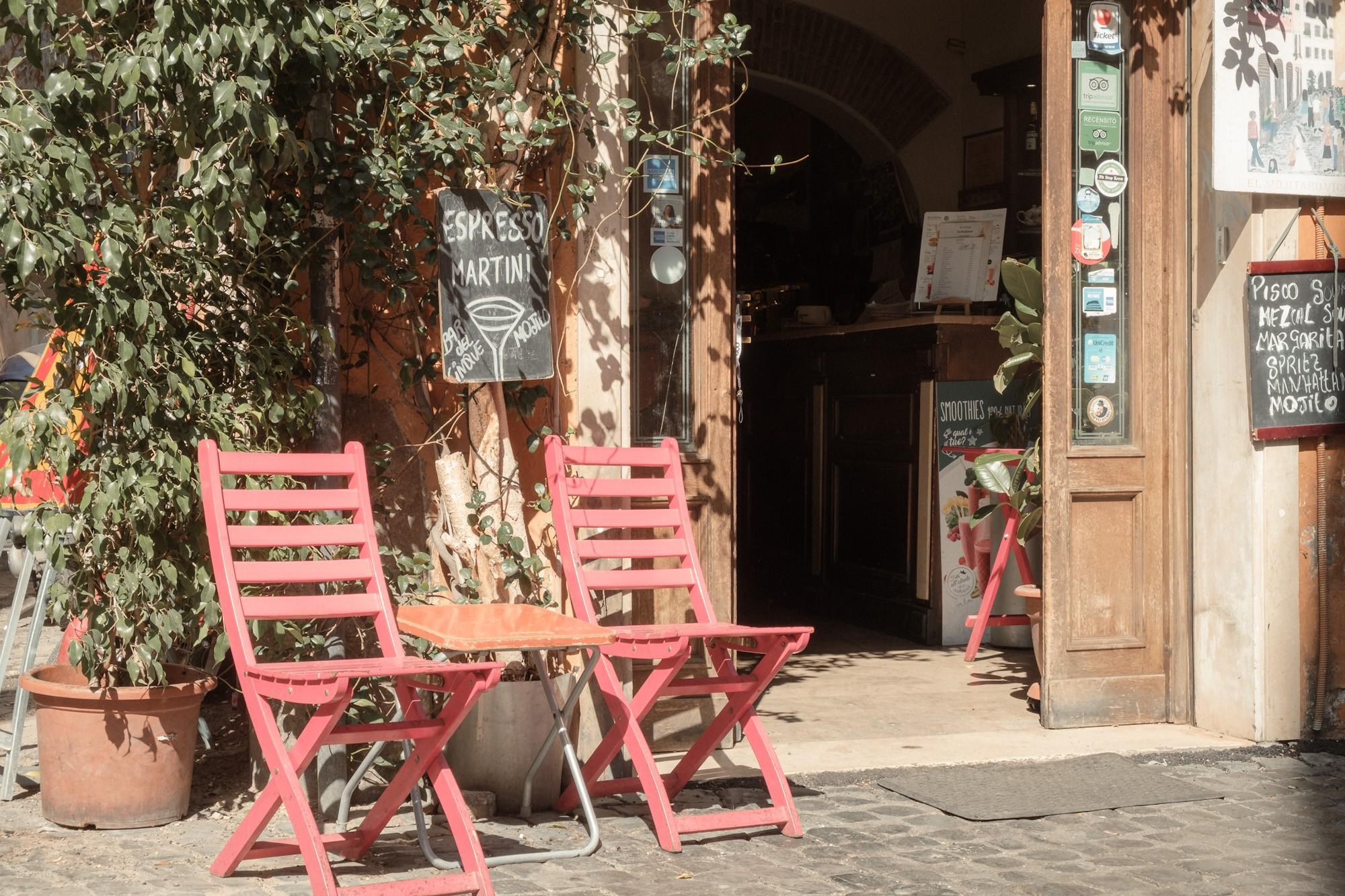
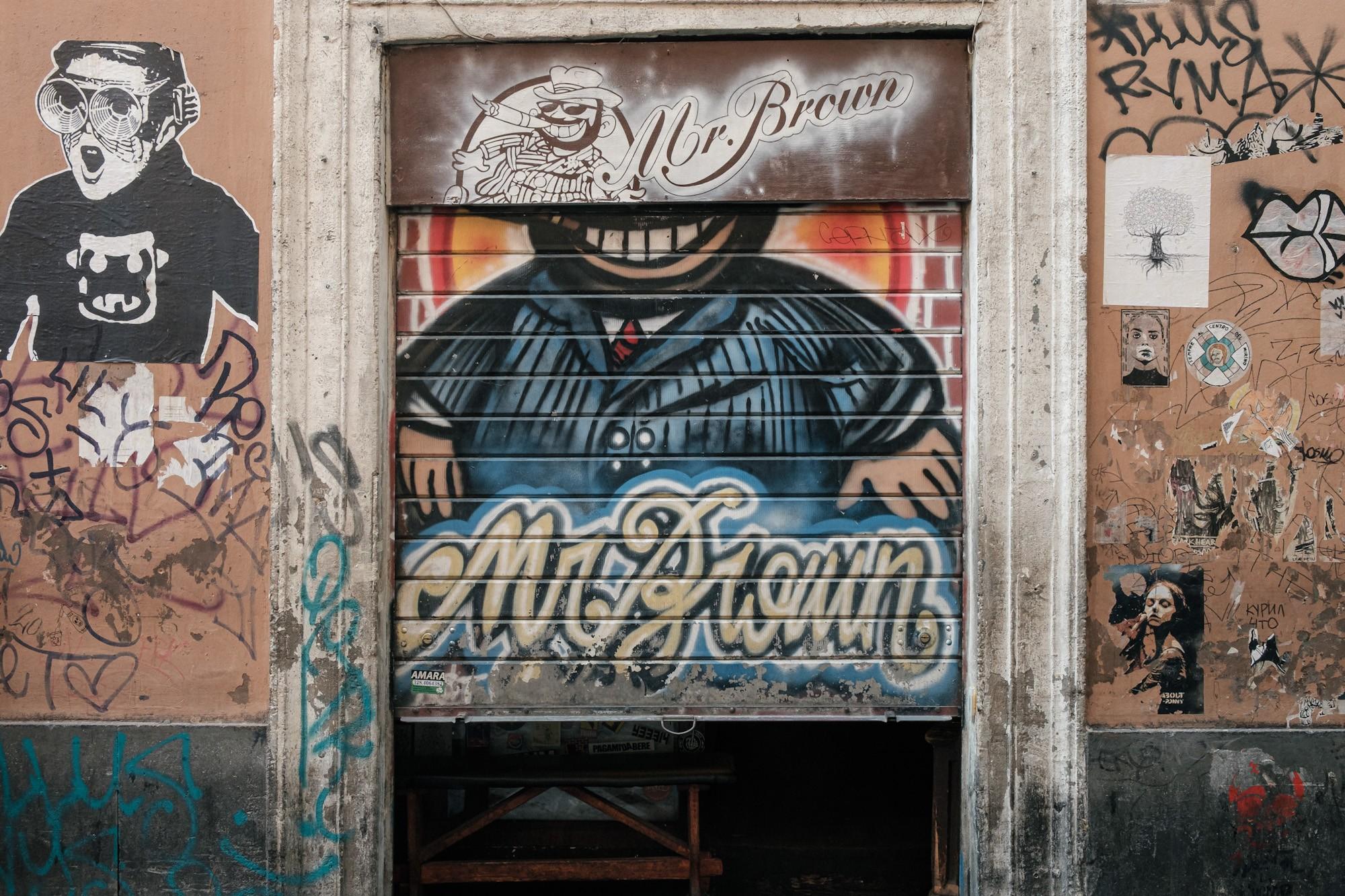
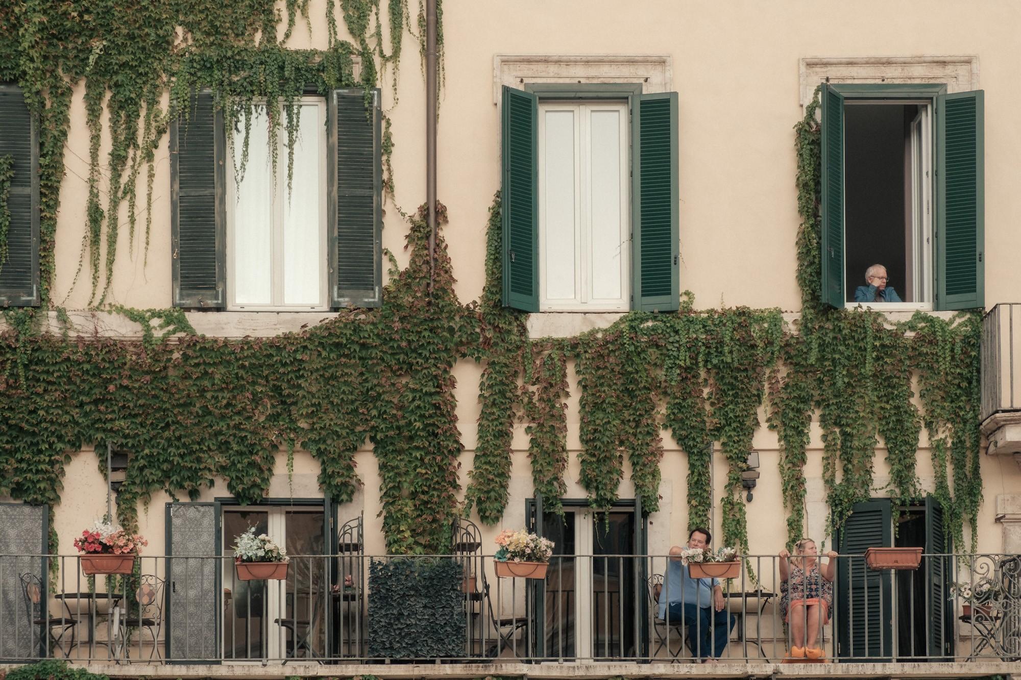
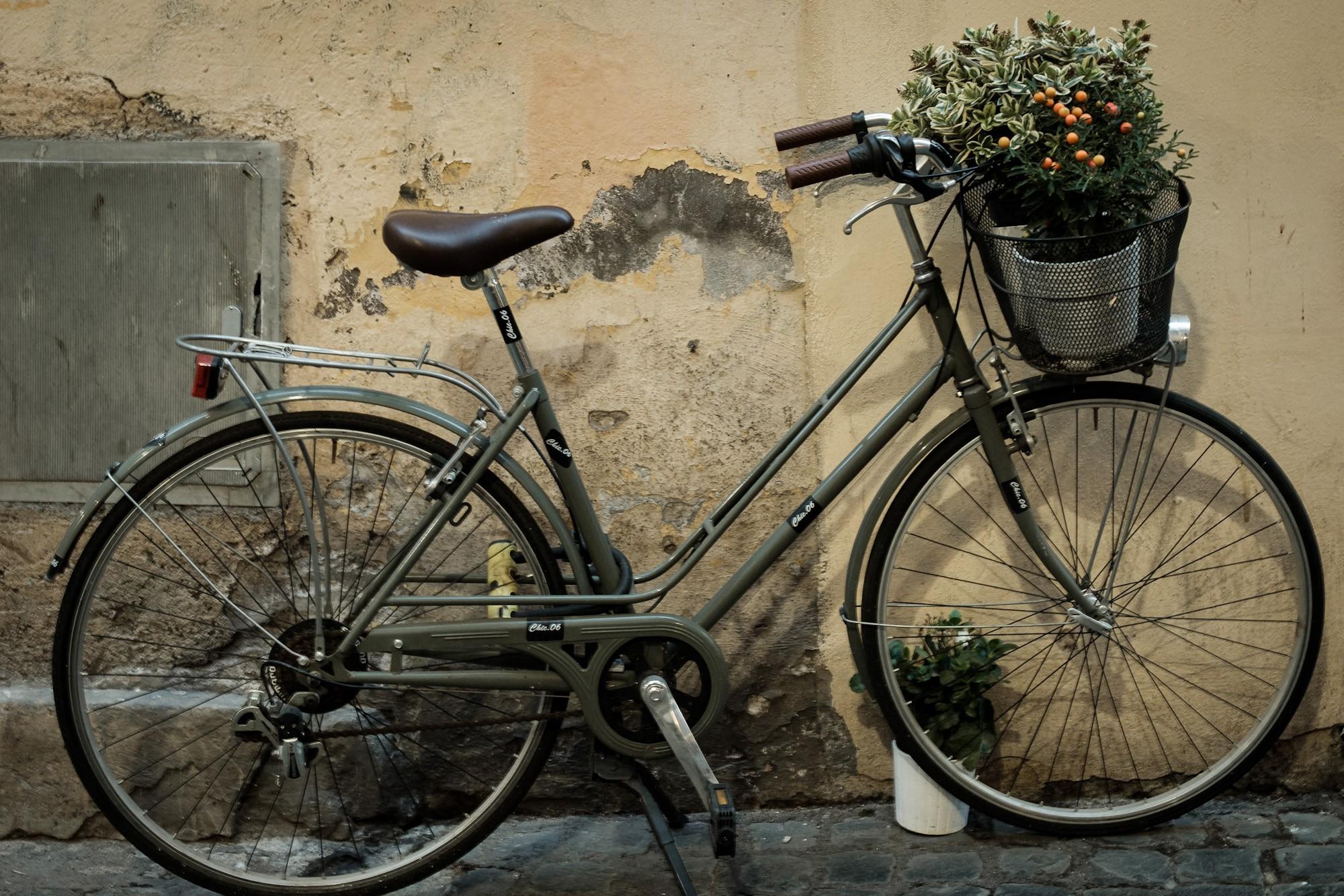
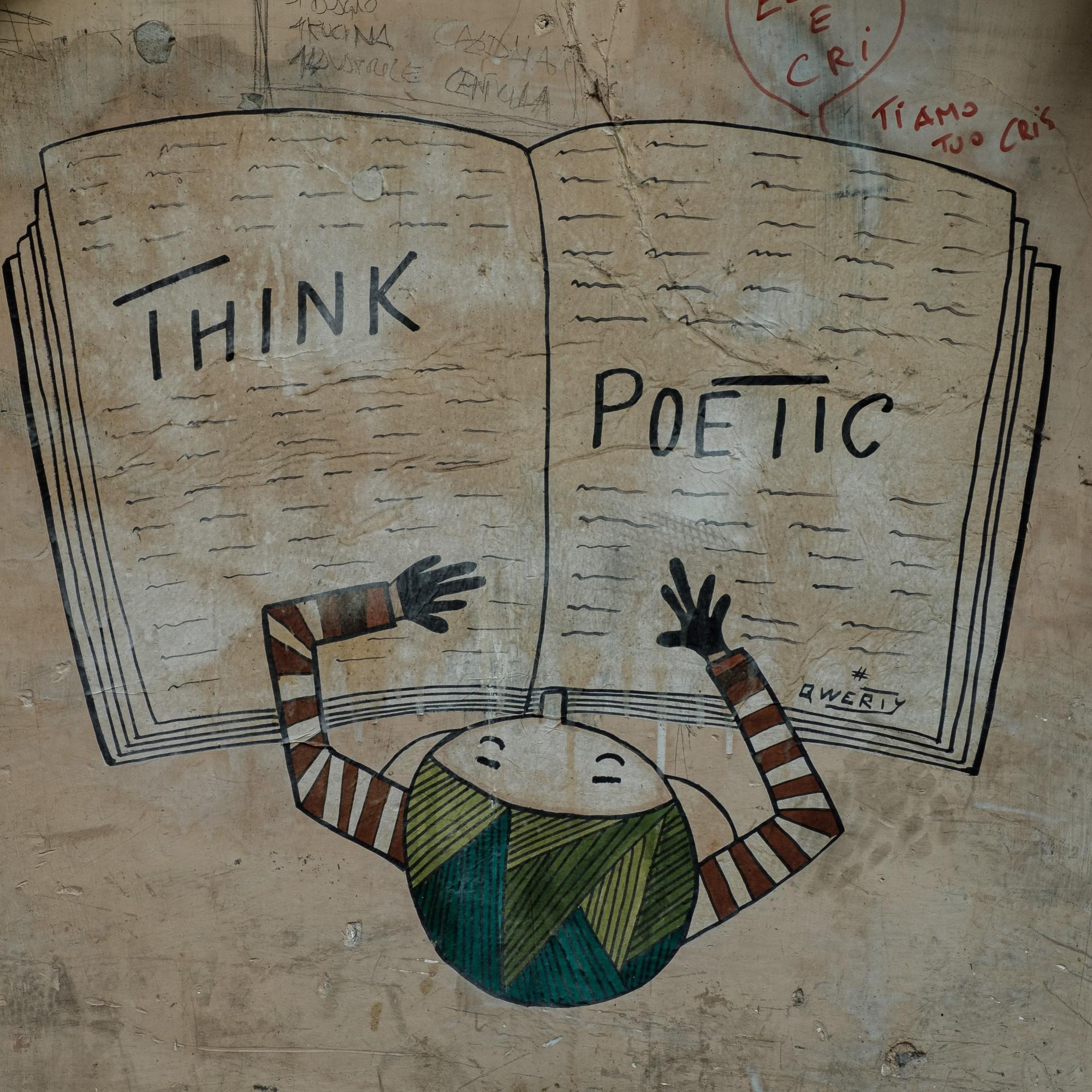
I focused on what exists between the tourist moments – scooters parked in repetitive patterns – a bicycle leaning against a worn wall – an empty restaurant in harsh midday light – graffiti that isn’t beautiful, but alive – people in balconies, in their own time – quiet streets with no action, but strong atmosphere.
None of these images try to impress. They just show reality.
Why I Avoided Postcard Rome
Touristic images come with a predefined visual language.
When you photograph something like the Colosseum, the composition is already known, the light is expected, and the result is predictable. You’re not building the image anymore — you’re reproducing it.
This series needed space for interpretation. It needed images that aren’t obvious, that don’t rely on instant impact but grow over time.
The Logic Behind the Selection
All ten frames follow a few simple rules:
Texture Before Subject
Walls, asphalt, doors, metal — surfaces matter as much as the subject. These are images of texture and time.
Controlled Imperfection
Nothing is perfectly composed or perfectly lit. Slight imbalance, harsh light, incomplete frames — all of it stays.
Rhythm
The series alternates between:
– dense frames (graffiti, scooters)
– calm frames (bicycle, streets)
– human presence (balconies)
– atmospheric moments (sky)
Color as Accent
Even where color is strong, it’s controlled. Nothing is allowed to become dominant.
The images are not spectacular. They are ordinary — and often overlooked. That’s the point.
How I Approached the Editing
The goal was not to make the images look good, but to make them feel right.
If the photographs are about texture, imperfection and everyday life, then the edit cannot be glossy or overly saturated. That would break the idea.
The direction was simple:
– less digital, more analog
– less impact, more atmosphere
Why Classic Chrome Instead of Velvia
Rome is colorful — but not in the way it’s usually presented.
Velvia exaggerates: – strong saturation – boosted yellows and reds – a high-impact travel look
Classic Chrome does the opposite:
– slightly desaturates colors
– shifts tones toward a muted, dusty palette – improves tonal separation – keeps the image grounded
The goal wasn’t beautiful Rome. It was a believable one.
Why I Didn’t Use a Global Preset
Using a single preset across all images would have flattened the series.
The light is different in every frame:
– harsh (restaurant, scooters)
– soft (bicycle)
– dramatic (sky)
– neutral (graffiti)
Each image also plays a different role.
Applying the same edit everywhere would remove those differences and make the series predictable.
Consistency doesn’t come from identical settings. It comes from direction.
Across all images:
– colors are slightly desaturated
– tones are warm but controlled
– blacks are deeper
– highlights are restrained
– grain is present
What I Actually Did
I didn’t apply a preset.
I made small adjustments to each image so they all exist in the same visual world. Some are warmer, some flatter, some more contrasty.
But they belong together. Well, at least in my opinion.
Why Some Images Are Flatter and Others More Contrasty
This is intentional.
Editing follows the mood of each frame.
Calm frames: – lower contrast – softer highlights – reduced color
Dynamic frames: – stronger contrast – deeper blacks – more texture
Atmospheric frames: – controlled highlights – preserved shadows – balanced contrast
This variation creates a visual rhythm: strong → calm → dense → open
Editing Guide — Core Direction
The goal is not to create a striking look, but a believable one.
White Balance – slightly warm – slight magenta shift → removes green cast
Contrast & Tones – lower highlights – controlled shadows – deeper blacks → depth without HDR
Color – reduce, don’t amplify – moderate vibrance – slight desaturation
HSL:
– yellow → toward orange
– green → desaturated, slightly olive
– blue → reduced
Texture – moderate texture – low clarity – minimal dehaze
Grain – present across all images – stronger on gritty frames
Film Simulation / Preset (Starting Point)
Fujifilm (in-camera)
Start from Classic Chrome:
– Highlight: -1
– Shadow: -1
– Color: -2
– Sharpness: -1
– Noise Reduction: -4
– Grain: Weak / Small
Lightroom (basic preset)
– Contrast: +10 / +15
– Highlights: -30 / -50
– Shadows: +10 / -20
– Blacks: -20 / -30
– Saturation: -5 / -10
HSL: – Yellow → Hue -10 – Green → Sat -20 – Blue → Sat -10
Final idea
The goal is not to make all images identical, but to bring them into the same visual universe.
A preset is just the starting point.
Consistence comes from how you adjust each frame — based on light, mood, and its role in the series.
Fără comentarii